
AMBESTEN
Industry
Logistics
Year
2023

[Overview]
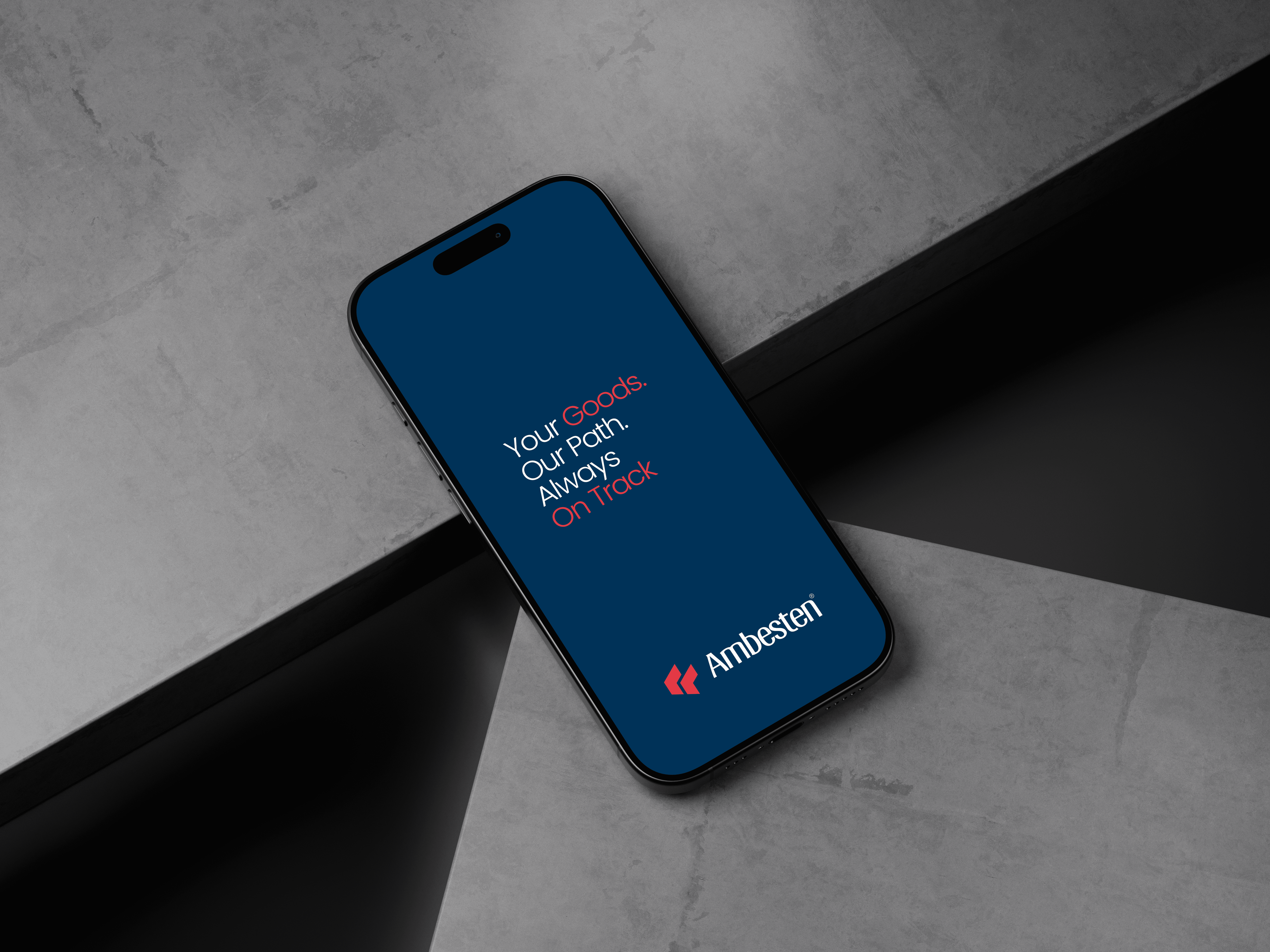
The identity captures AMBESTEN’s spirit of direction, precision, and global connectivity. AMBESTEN isn’t just about moving items. it’s about redefining how businesses navigate borders, timelines, and supply chains.
The bold geometric mark represents strength, stability, and the dual flow of international trade goods coming in and goods going out all controlled with clarity and expertise.
Every visual choice was intentional:
from the upward-angled mark that scales seamlessly across vessels, documents, digital platforms, and fleet branding, to its solid impact in both color and monochrome applications.
This is more than a logo; it’s a symbol of trusted movement, structured processes, and dependable global trade.

[Challenge]
Ambesten needed a clear and credible brand identity to represent its wide logistics services — import & export, clearing and forwarding, logistics support, and auto importation — in a highly competitive industry where trust and clarity matter.
[Solution]
We created a structured, modern brand identity built around direction, reliability, and global movement. The system was designed to scale seamlessly across documents, fleet branding, digital platforms, and operational touchpoints while clearly communicating Ambesten’s capabilities.

[Result]
The new identity positions Ambesten as a confident, trustworthy logistics partner. It improves brand recognition, strengthens credibility, and provides a clear foundation for growth across local and international markets.
